Naturally, people have always wanted to know everything about the recent trends in order to be as modern and fashionable as they can. Still, fashion is a quite unpredictable thing that enjoys changes, so there are new trends appearing every year, season or even month. Talking about the site launching, today one can find a huge amount of various online projects. Thus, you need to think about the creation of your site more watchfully in order to get a success. Seeing that, in this post I’m going to share with you 8 secrets of a winning website building that will easily help you to stand out from the crowd. Some of these tips are about beauty and some of them are about the technical side of the question. Needless to say, the main secret of any project’s popularity is about an ideal mix of magnificence and comfort. Seems to be an easy task but sometimes people just forget about the second component. Anyway, let’s start!
1. Flat Design

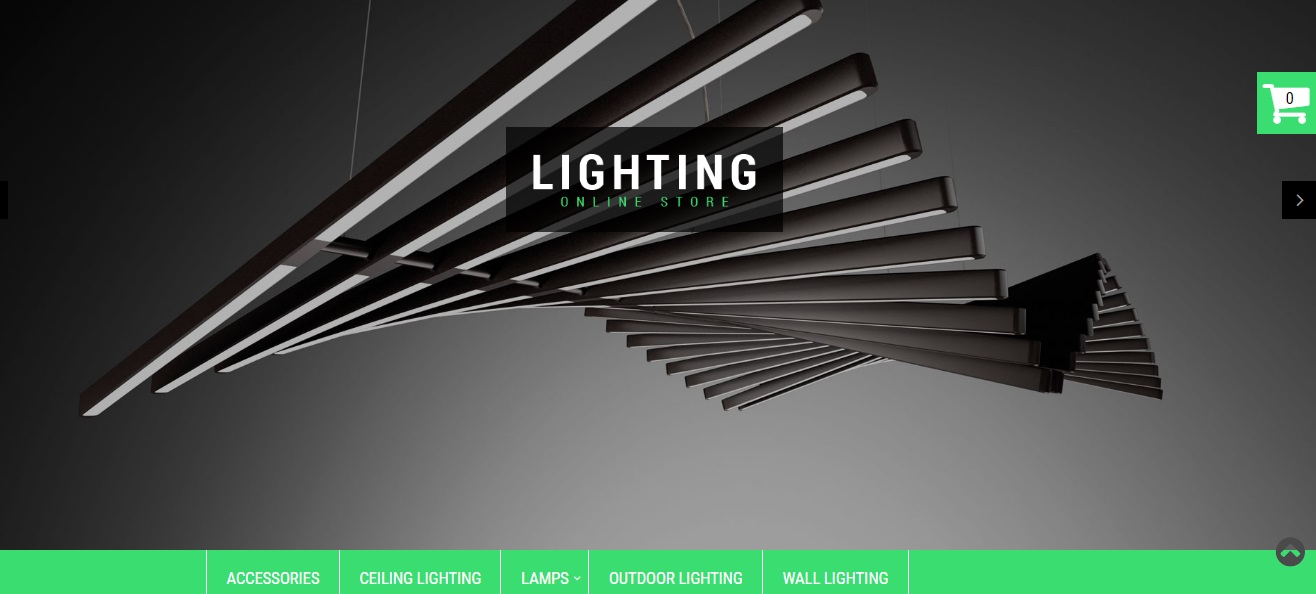
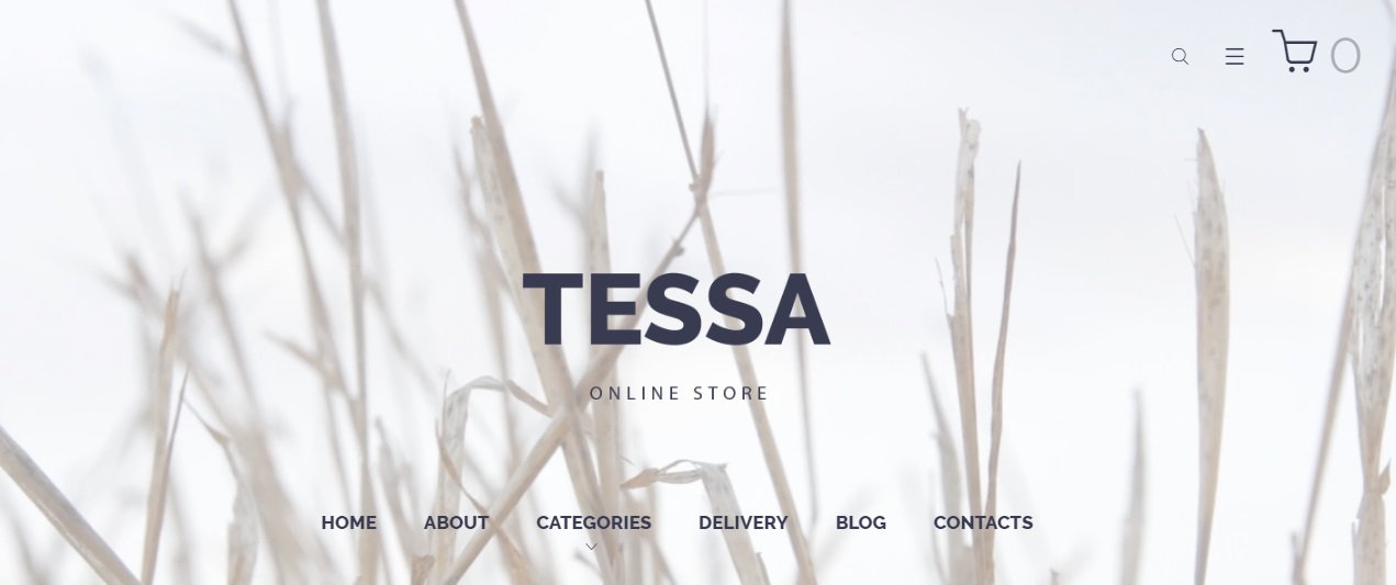
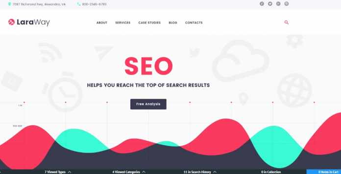
Now let’s remind Mr. Churchill, who is the author of this amazing quote: ‘All the great things are simple, and many could be expressed in a single word: freedom, justice, honor, duty, mercy, hope.’ Well said! Oh, and it is such a pity that Sir Winston has never heard about the definition of ‘Flat Design’ or ‘Parallax Effect’! I am sure he would definitely add them the list of the great but simple things. To make things easier, flat design is a minimalist user interface design approach that mainly provides usability, but now we are going to talk about the other aspect of the question. As you may know, today flat design is a quite popular appearance of a site that consists of pleasant images, fabulous color palette and neat, inimitable web fonts. All in all, it features clean, open space and crisp edges! Needless to say, the mentioned items should be used in order to emphasize the subject of your online project and transform the last one into a tasty candy, so there is nothing redundant. What is more, it makes much easier to design an interface, which is responsive to changes in a browser size across the different devices but we will talk about it a little bit later
Still believe that flat design is something about a prehistorical version of Windows? Hey, don’t be so boring! Just check the demo version of the provided modern theme to see the real look of the feature!
2. Disciplined color palettes

As you may see from the previous point, simple may be really stylish! To continue the theme, keep in mind that the same thing is about the color palettes for the sites, as they are going back to basics. Today in trend are neat, two-color schemes and even single color in addition to black or/and white!
3. Typography becomes richer
As you may know, during last years the most popular fonts were the simple neo-grotesque ones (e.g. Roboto, Open Sans, Helvetica, Lato, etc.) that are quite readable and comfortable to be used for the paragraphs. All in all, trends are always unpredictable, so there are some changes that one can also see in the typeface! Wondering what is popular among the web designers today? Well, talking about the web fonts, they prefer to work with opposites. I mean contrasts are trendy again! For example, some serif fonts (contemporary looking fonts without some decorative finishes, e.g. Arial, Circular, Gotham, Futura, Avenir, Verdana, Franklin Gothic, etc.) are commonly used with the non-serif ones now. In addition, today such cool things as animated texts are also in use, so there are a lot of videos, images and effects placed on them.
4. Cinemagraphs
To continue, texts are not the only thing, which becomes more creative. Surely, inimitable shots has always been a must-have for an attractive site, so keep in mind that you should think more watchfully about the pics that you want to use for your online project in future. What is more, it is not a secret that many successful companies as well as popular web designers even use the services of the professional photographers, as they want to get some exclusive pics for their sites to be truly unique. I’m sure you know a lot about the advantages of high-quality pics or gifs, so let’s discuss another impressing and inspiring aspect that may be quite useful for your online project! Actually various animations (videos, SVGs, gifs, WebGL CSS) were pretty popular during the last year but now we are going to talk about the other kind of a picture in action. To make a long story short, cinemagrafs are not the usual animations. Basically, they are the images that have the minor elements moving in the composition. Needless to say, such step can not only add some realism to a picture but also attract the people to the subject of your site. Just take a closer look at the pic below! Without a doubt cinemagraphs are the next undeniable trend of 2017!
5. Impress your visitors with Parallax Scrolling

Would you like to hear about the next option, which is able to make your project more attractive? For these simple reasons, let’s take a look at parallax effect! Originally, parallax scrolling is a cool and recent web trend that involves background moving at a slower rate to the foreground and creates a fantastic 3D effect when a person is scrolling a page of your site. As you can see below, this graphical effect gives one an unbelievable sense of depth and motion. Actually, the effect was created for using in the video games, but today parallax scrolling is one of the most popular and even indispensable features for any winning online project. To sum everything up, let’s see the list below!
1. To start with, a gorgeous design of your site will quickly show the results of a longer visitors time on the page and its traffic will be increased with no effort!
2. Moreover, with the help parallax effect you get an easy possibility to build a clear and inviting information path to guide web audience through the site in order to present all aspects of its attractiveness.
3. In addition, now the feature is suitable not only for a two-dimensional creation! Furthermore, you may also use parallax effect as a great way to add different effects (e.g. some icon enlargement, moving or minimization – things that are easily based on scrolling) to a desired website.
4. As a result, such modern thing as parallax scrolling lets one became the glad owner of the magnificent and unique online project!
6. The videos are still trendy!

Without a doubt the newest resources let one to present their business in the most entertaining way with the help of different videos, so today you can add to your site any media that you like. What is more, now you can do it even with the menu of your online project! All in all, media is a thing, which quickly takes over the internet, so it would be a great idea for the marketing purposes because with the help of the videos your services and thoughts will be widespread in all the popular social media in one click! By the way, it was suggested on the Hubspot that by 2018, about 80 % of all the user internet traffic will be media! Moreover, they also found out that more than 50 % of a whole today’s mobile traffic are already related to media! Thus, don’t forget to use some qualitative, creative, bright and, of course, informative videos for your site! In the end, you get an easy method to show your products or services to the web audience. By the way, such step will also save your potential clients time.
7. Mobile-friendly design

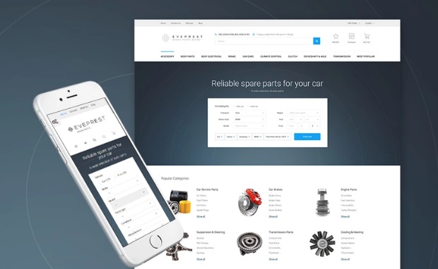
So, now you know a lot about beauty. Still, there are some technical questions to be mentioned! How do you think, what is the most proffered way to visit a site today? Without a doubt, everyday people use their mobile phones in order to see something interesting on the internet because today all the gadgets are multifunctional. Needless to say, these comfortable devices allow one to easily save their time or simply pass it. Seeing that, don’t hesitate to learn more about mobile-first design that is the next trend for today! As the name says, mobile-first design is the process of a site creation for the small screened devices and then working up to the bigger desktop version to be used for larger gadgets. As a result, you will get a fabulous, well-running and powerful site that will both look and work ideally in all the browsers and on all the devices. That is why mobile-first design has already become a fast growing website trend, which is also indispensible for a cool and successful online project! To sum everything up, below you can find 3 simple reasons telling about the undeniable pluses of mobile-first design.
1 Firstly, for now there are nearly 1.2 billion mobile users in the whole world.
2 Secondly, various mobile apps have been downloaded more them 11 billion times for today!
3 Thirdly, the sales of different mobile devices quickly increase every day and now it’s across the board with more than 85 % of the new cell phones that allow their users to access the mobile web space in the most comfortable way!
4 Finally, mobile-first design is definitely able to save not only your time but the time of your clients too!
8. More Responsive design for your website

I know that having a strong desire to create a worthy and absolutely fashionable site doesn’t always mean having some special skills of a coding guru that one may use for these seasons. That is why I’m happy to tell you that there are a lot of awesome and useful features that one can easily have to build a website of their dream! Basically, a responsive design is mostly an approach to set up an online project using CSS (Cascading Style Sheets) media queries and flexible layouts that are already pre-loaded for your convenience. Moreover, this feature is able to easily work hand-in-hand with the previous point of the post – mobile-first design. Therefore, mobile-first design creates the experience and the look of a site, while responsive design factually realizes this task. As a result, the feature in question makes an additional way for your online project to be ideally displayed on the devices that have different sizes! Furthermore, keep in mind that your website will productively transport any type of content on cells as well as on the tablet, laptops or the various big-screened desktops! All in all, isn’t it a nice way to tell the world about your online business?
To finish with, if you are a person that is looking for a nice possibility to launch a beautiful, well-adoptive and reliable site, I suggest you to take a look at this page that shows a huge and impressing selection of brilliant, intense, multifunctional and responsive website templates that were made, featured and thoroughly designed for you by the oldest developer ob website creation, called TemplateMonster. You will see that the packs of all these themes include a list of the pre-build patterns that will positively help one to get the desired results and even more! By the way, the company provides all its users with templates customization and free 24/7 technical support, so don’t miss your chance to contact their Service Center to get more info!
Now you know a lot of ways to make your website look trendy. Given these points, what do you think about the future of website design? Maybe you have your own rules that are indispensible for a successful online project? Or maybe you have already tried some of the mentioned features, and have some opinion to share? All in all, don’t hesitate to leave all of your questions, suggestions and reviews in the comments below, as I am always happy to hear from you!

